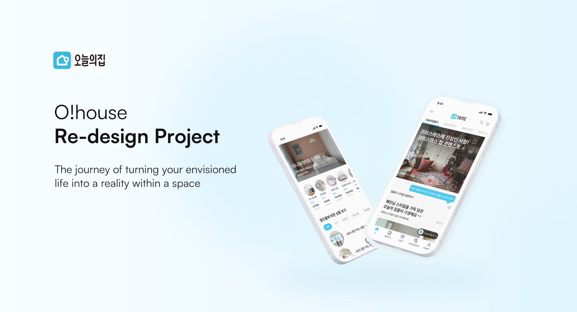
The redesign of O!house, a widely popular Korean mobile platform specializing in furniture and interior design, focused on addressing user pain points and enhancing the overall experience to create a more intuitive and seamless platform for its audience
Background
How Can We Enhance the Interior Design Service?
A home is a space that brings comfort, and choosing the right furniture and decor enhances our quality of life. Today’s House app provides a great way to explore various interior designs and allows users to purchase furniture to create their own spaces. However, some users have found it inconvenient. To address these issues, we undertook a redesign to increase usability and better meet user needs.
Design Process
Discover > Define > Develop > Deliver ( Design Thinking )
Desk Research
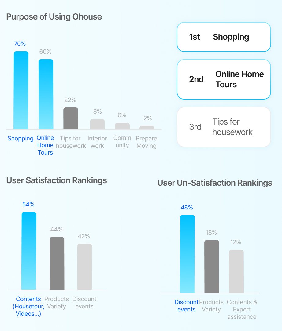
Why are you using O!house?
Most users turn to Today’s House for shopping, with online home tours as the second most popular feature.
Users primarily utilize shopping and content-related features.
User satisfaction rankings highlight the diverse content, product variety, and discount events, while dissatisfaction rankings show a need for improvement in discount events, product selection, and expert assistance.
One notable insight is that “Discount events” appeared in both satisfaction and dissatisfaction lists, indicating a key area for improvement.
User Research
Contents,
Community, Commerce
All-In-One Platform, O!house
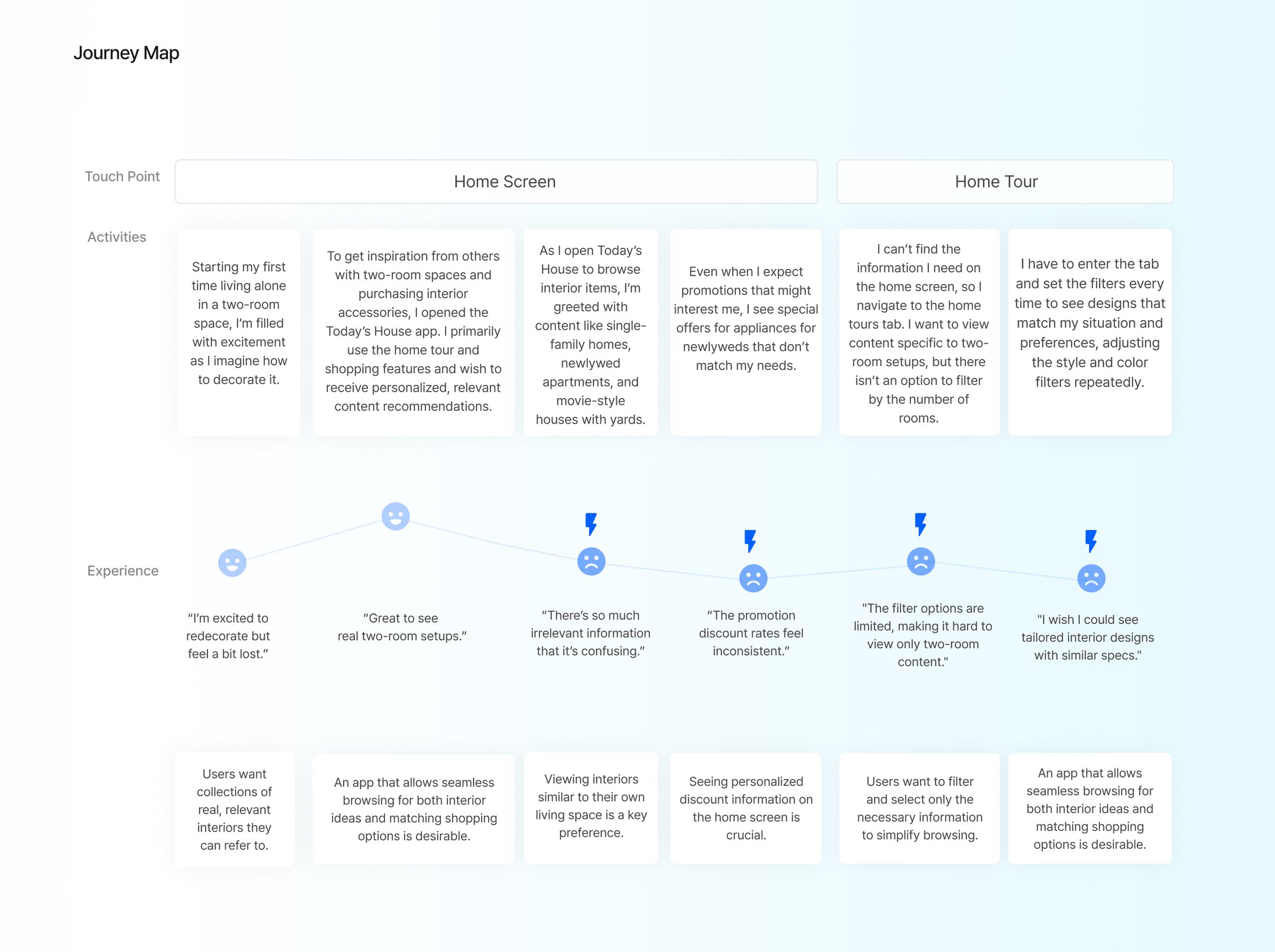
We discovered that users need more personalized services and content recommendations.
Despite high satisfaction with content, its lower ranking in dissatisfaction suggests that further improvements are necessary.

Kyungeun, Lee
“There’s so much overlapping content and features… it feels cluttered.”
“They provide a lot of information, but it’s hard to know what to look at on the home screen.”

Hyeyoung, Kim
“I’m looking for apartment-related content, but I mostly see one-room and unrelated products.”

Sara, Choi
“They recommend products they think I need, but I don’t actually need them.”
“It’d be great if I could view only relevant ads and discounts.”

Nayoung, Bae
“I'd love to learn about discount deals, like Black Friday offers, through the ad banners.”
“I sometimes click on home tour content just because it looks pretty and end up buying the recommended products.”
Persona
- Name
- Hye-min Song
- Occupation
- Designer
- Gender
- Female
- Living Situation
- One-room apartment/ recently moved
- Age
- 26

“I want a space of my own for my first time living alone.”
“Expensive products are a burden. I want to buy good products at affordable prices.”
“I’m very interested in interior design.”
Frustration
Hye-min Song, who recently moved and wanted to decorate her place, used Today’s House as a reference. However, there was too much information, most of which was irrelevant to her needs. Discount details didn’t match her interests, and it was difficult to find coupons that applied to her.
Personal Goal
She wants to see home tour content tailored to her preferences and find products she likes that are reasonably priced so she can create a space she loves without breaking the bank.
User Journey Map
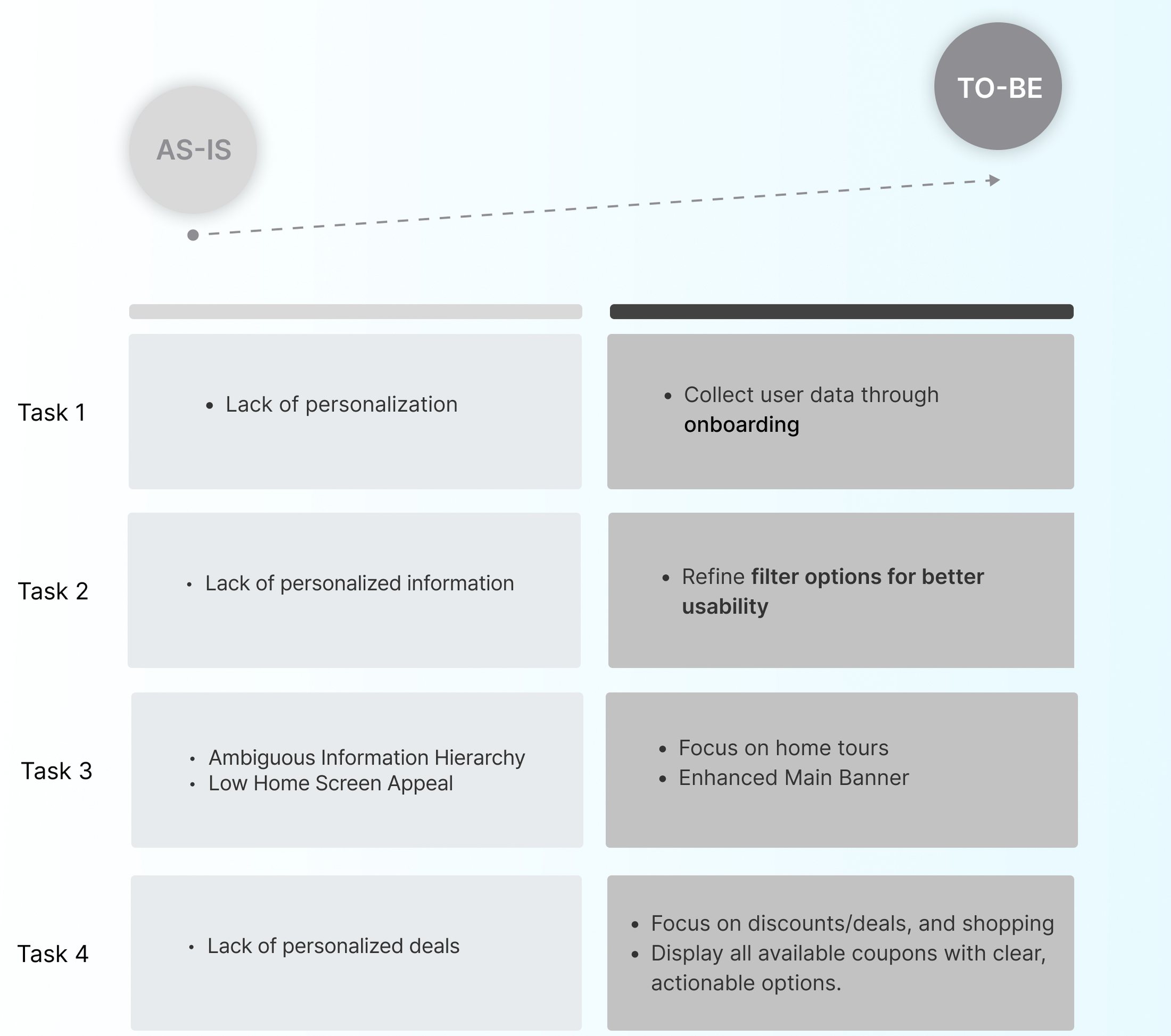
Problem
Irrelevant recommended content for users,
a cluttered interface, and difficulty in viewing discount offers
Home
Irrelevant recommended content
Cluttered interface
Shopping
Users seeking discounts/offers
UI
Complex interface layout
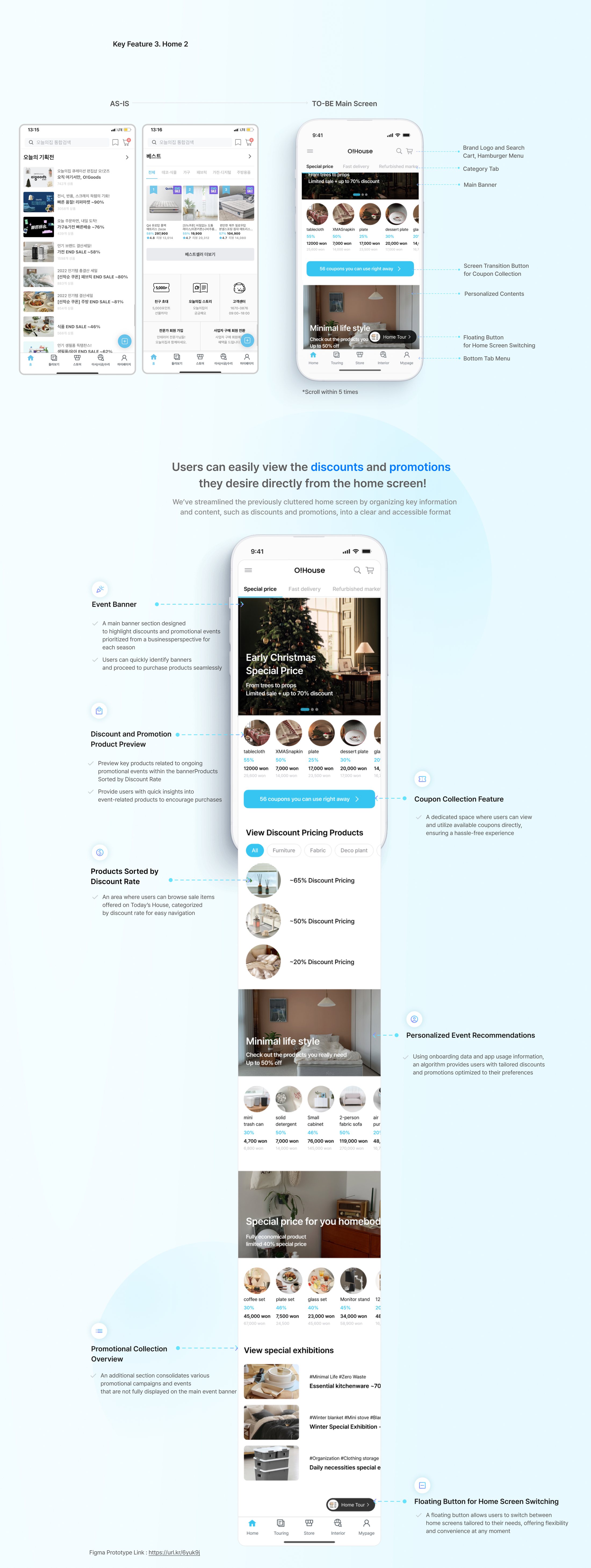
Solution
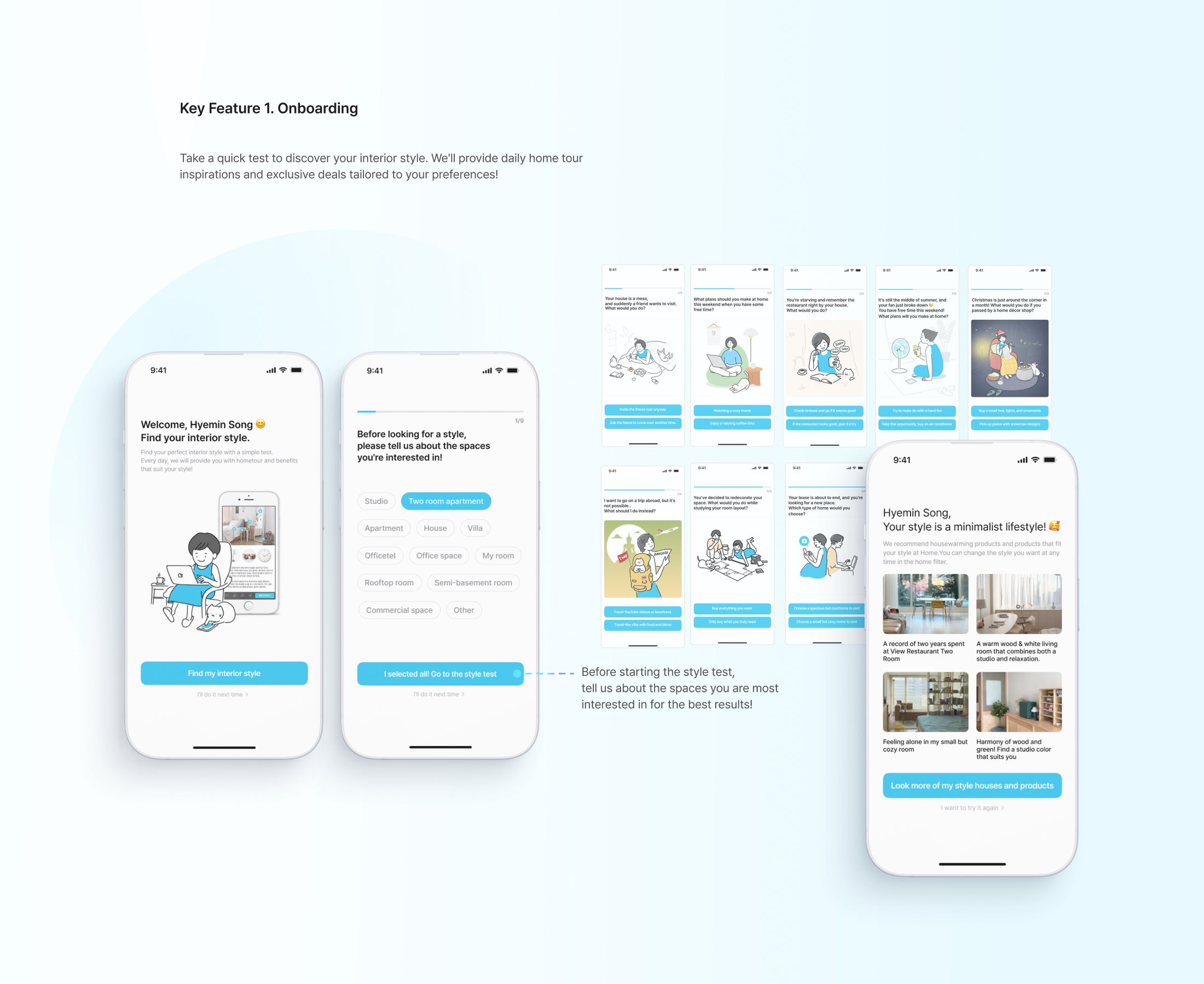
- Home: User analysis through onboarding,
Enhanced home tour content tailored to user preferences - Shopping: Easy access to promotions and discount offers
- UI: Establish a consistent design system
Home
Personalized user experience
Shopping
Focus on essential information
UI
Strengthen Today’s House brand identity
Project Goal
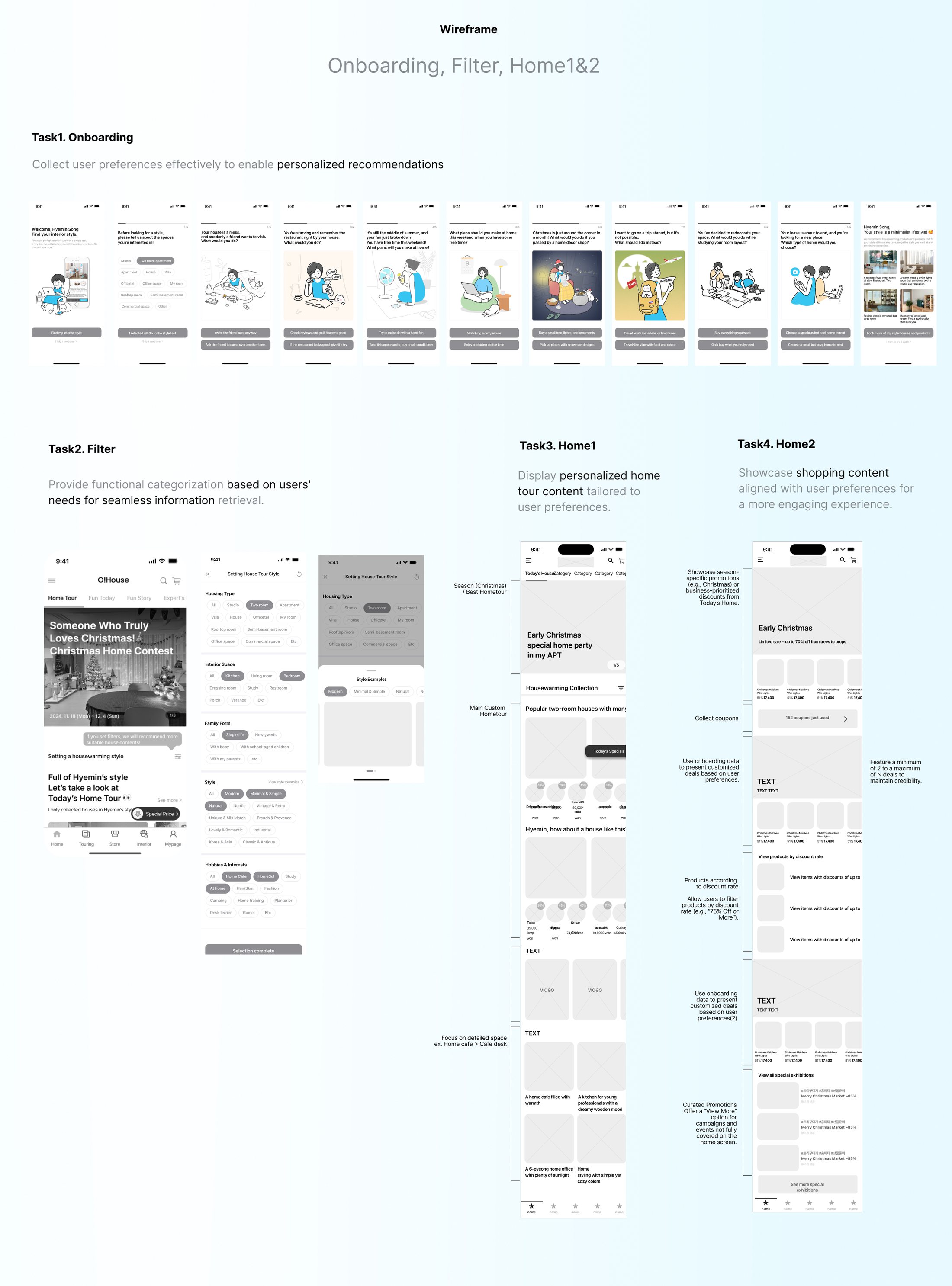
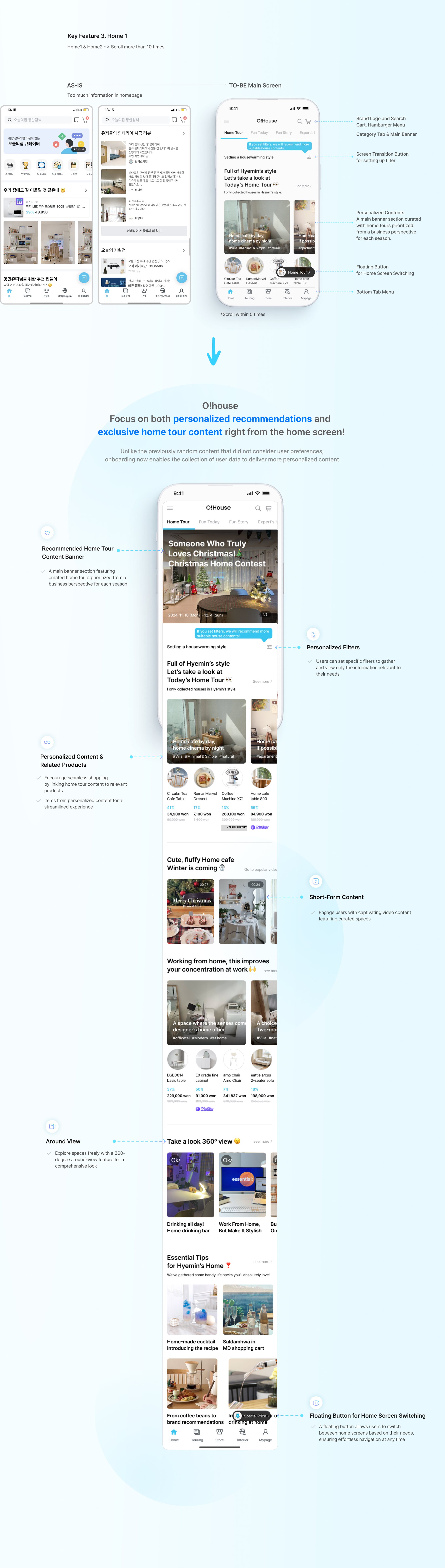
Analyze individual preferences through onboarding,
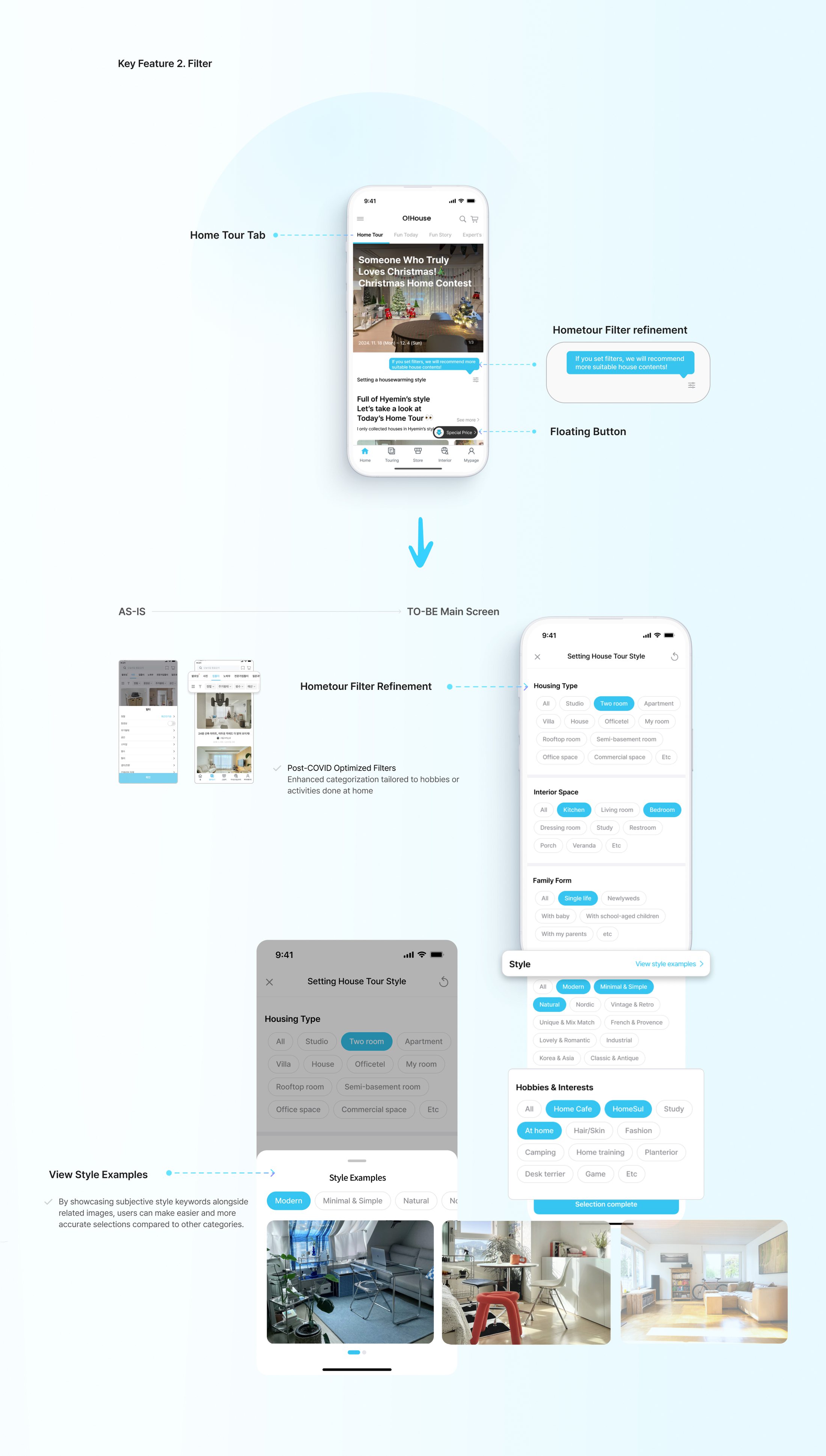
help users find desired home tours via filters,
and offer two tailored home screen options:
Home Tour-Oriented and Purchase-Oriented displays.
Wireframe
User Test
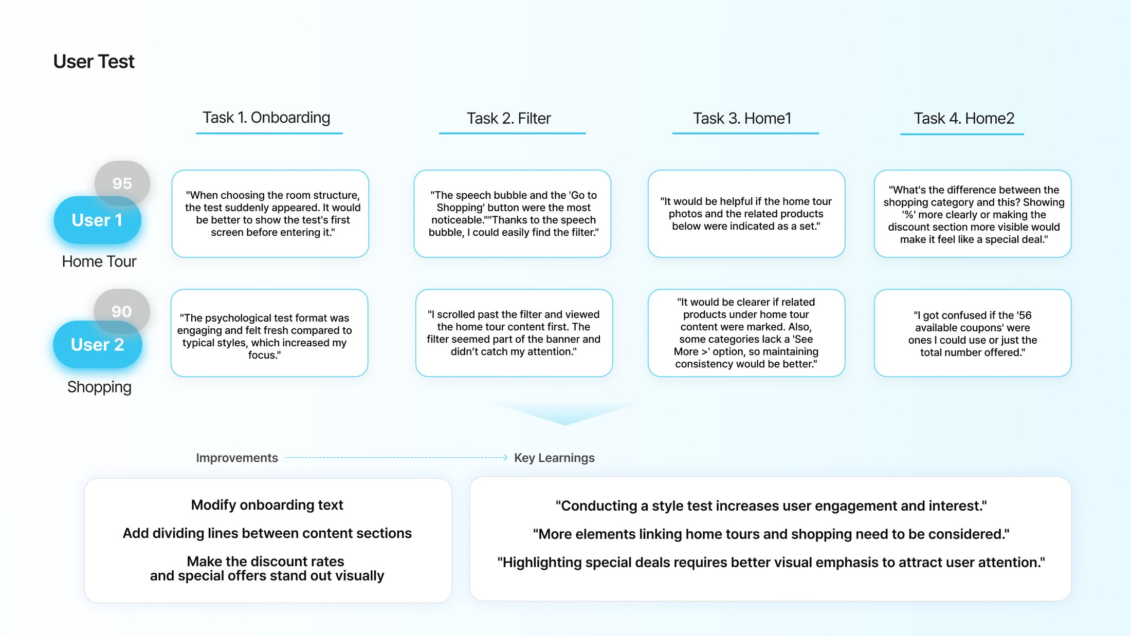
Improvements
- Modify onboarding text
- Add dividing lines between content sections
- Make the discount rates and special offers stand out visually
Key Learnings
- “Conducting a style test increases user engagement and interest.”
- “More elements linking home tours and shopping need to be considered.”
- “Highlighting special deals requires better visual emphasis to attract user attention.”
Hi-Fidelity Design
Reflection

By prioritizing the most important aspects from the user's perspective and determining the key focus areas early on, it became much easier to identify what needed improvement.
This process emphasized the significance of approaching projects with a user-centered mindset. Instead of simply filling gaps, it was refreshing to work on a project aimed at streamlining and compacting an overwhelming amount of information.
Balancing user needs with business objectives allowed us to identify impactful touchpoints and refine the experience effectively.
See next
 Ready Action: An AI Scene Partner That Listens, Performs, and Coaches
 Gus in the Room: Bringing a Dog Into the Classroom Through a Robot’s Eye
 Toilet Delivery: Dignified Restroom Access for NYC Delivery Workers
 Sober Buddy: An AI Player That Joins the Table
 Budgie: Keeping Friendships Alive, One Chirp at a Time
 Dusty & Co.: Designing “Soft Clarity” for a Pottery Studio
 DriveBoy: An Emotional Co-Driver for Long-Haul Truck Drivers
 Industrious: Creating Natural, Authentic Connection in Shared Workspaces
 Hereiam: An AI-Driven Psychological Care Service
 Baekgomtang: A Climate Crisis Campaign Website
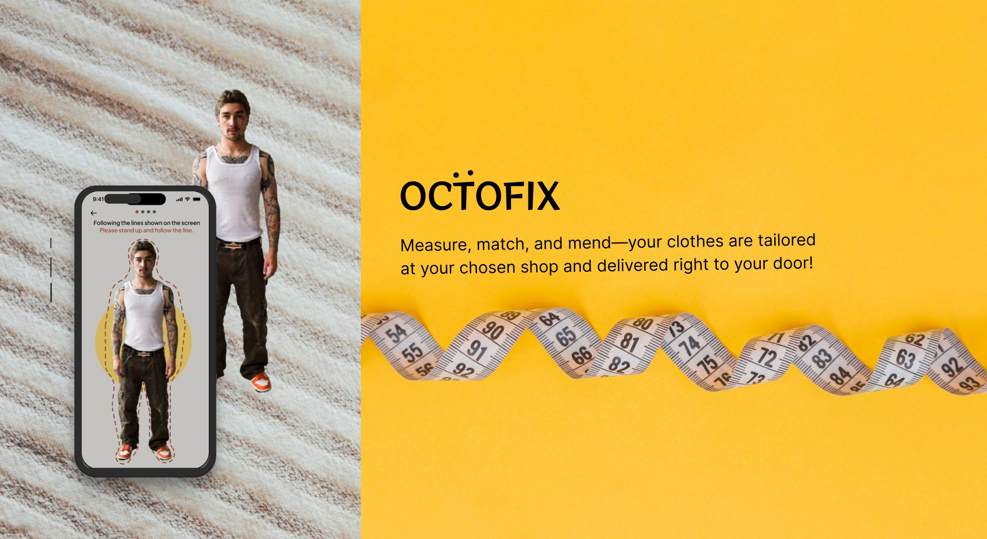 Octofix: A Direct Alteration Service for Purchase and Repairs
 Exhibition Assistant: Planning an Exhibition Day Made Easy← All work