Toilet Delivery: Dignified Restroom Access for NYC Delivery Workers
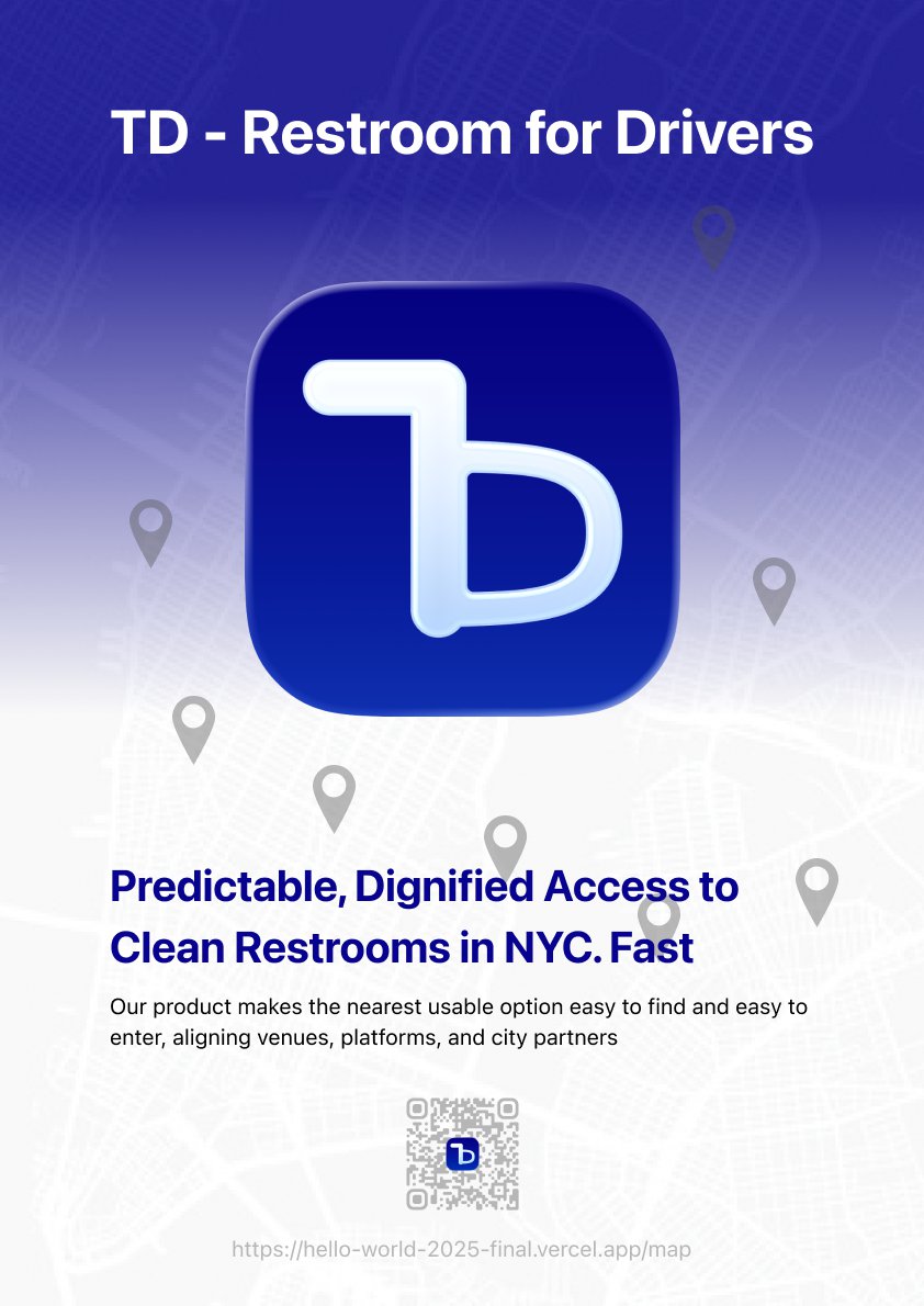
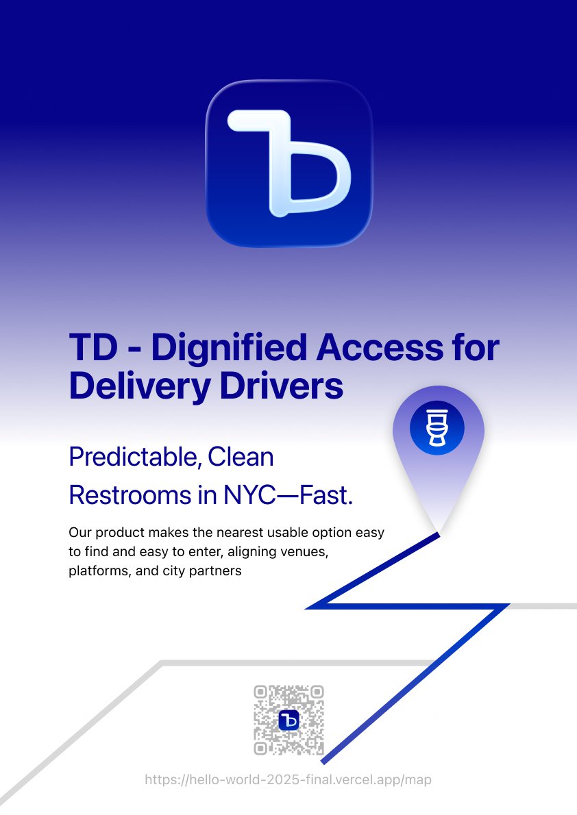
Delivery workers spend whole shifts on the road with little access to restrooms. Toilet Delivery is a map-based web app that makes the nearest usable restroom easy to find and easy to enter, so a quick, respectful bio break doesn’t disrupt the route.
Skip to solutionProblem
The city runs on deliveries. Its drivers have nowhere to go.
Delivery and gig workers are on the street all day, but restrooms in New York are scarce, unpredictable and often closed to them. Finding one means stopping, asking, and hoping, on a tight delivery clock.
No predictable option
Restroom access depends on which venue lets you in, so drivers end up negotiating or guessing at every stop.
Time on the clock
Every detour costs deliveries. A bio break has to fit inside the route, not break it.
Dignity
Being turned away, or using a dirty or unsafe restroom, is a daily, quiet indignity of gig work.
Problem statement
Delivery workers lack predictable, dignified access to clean restrooms during their shifts. How might we make the nearest usable option easy to find and easy to enter, without disrupting the route?
Users
Designed for street speed
Who it’s for
- Delivery and gig workers on bikes, mopeds and in cars
- Checking the phone in short glances between drops
- In a hurry, often on unfamiliar blocks
What they need
- The closest usable option, not every option
- Whether they can actually get in, before they go
- Confidence that it’s clean and safe
Principles
Calm, clear, and human
We set the tone before designing a single screen. Every touchpoint favors legibility over decoration, uses plain language, and aims to be a good citizen in the city: respectful of venues, mindful of neighbors, and focused on what works in the real world.
Calm
Neutral tone and subtle motion. Nothing that adds stress at street speed.
Clear
Legibility over decoration, plain language, and the closest usable option first.
Human
Dignity, predictability and safety; respectful of venues and neighbors.
Accessible
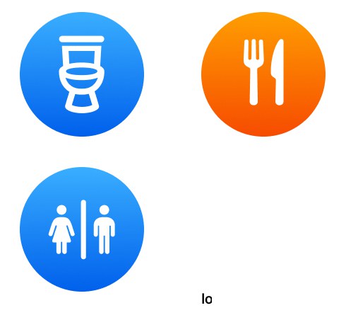
Large tap targets, high contrast and inclusive icons by default.
Solution
Find it, trust it, get in
An Apple-inspired map app built on NYC Open Data’s Public Restrooms dataset. Familiar patterns mean nothing to learn: open it, see what’s near, go.
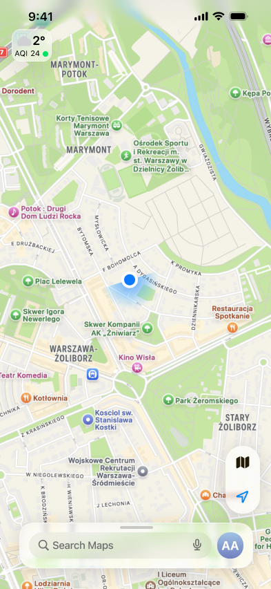
Map, centered on you
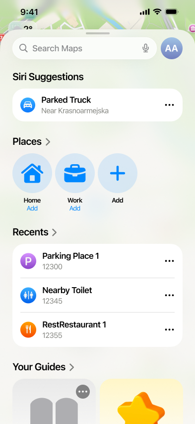
Suggestions, places and recents
Launch animation
Map-based browsing
A map centered on NYC with custom restroom pins and a clean, card-based layout with semantic colors.
“Around me” discovery
Nearby restrooms based on where you are, closest first, with clear distance and ETA.
Restroom detail cards
Venue name and type, access (public, staff-gated), hours and amenity tags like accessibility.
Ratings
A quick report on whether a restroom was usable and how clean it felt, building toward reliability scores.
Design System
A brand that feels like infrastructure
Logo
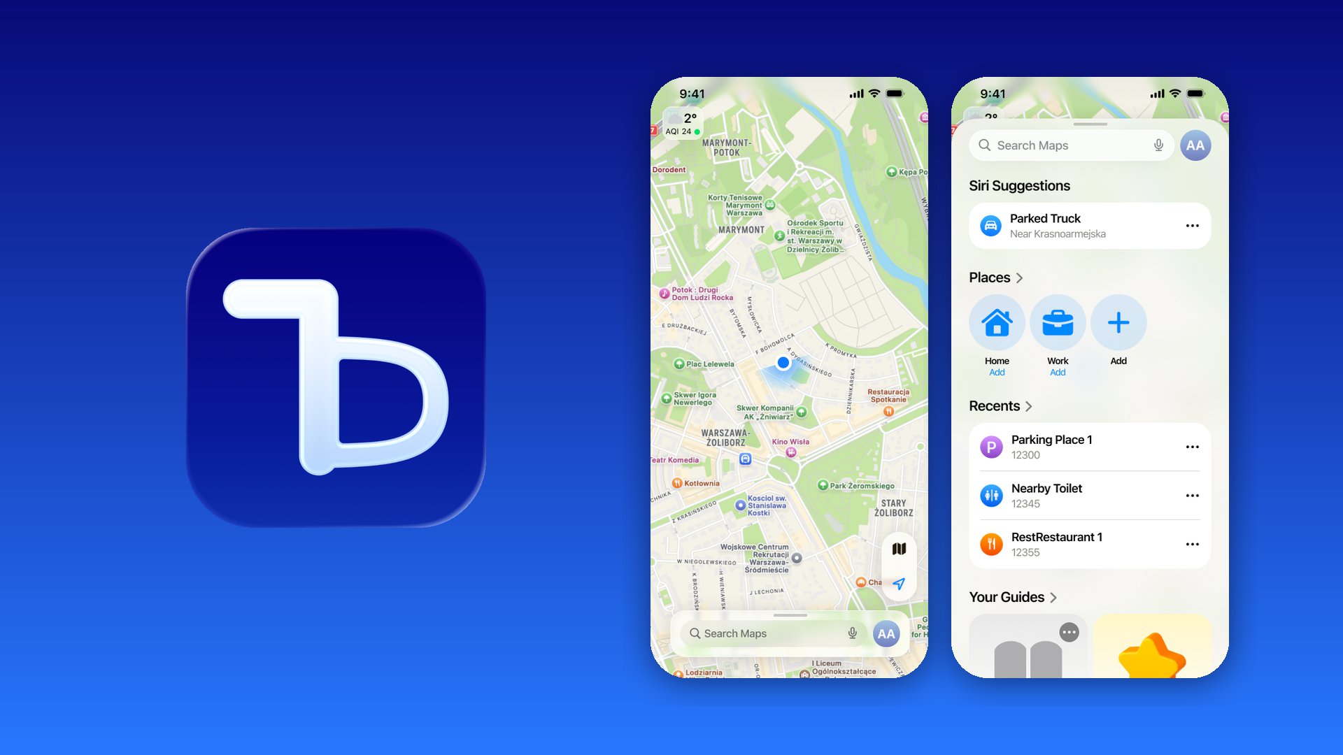
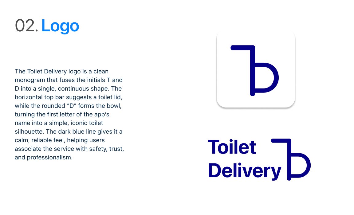
The logo is a clean monogram that fuses T and D into one continuous shape. The top bar suggests a toilet lid and the rounded D forms the bowl, so the first letter of the name becomes a simple, iconic toilet silhouette. The dark blue line feels calm and reliable, associated with safety, trust and professionalism.

The system follows iOS conventions so it feels native and trustworthy: SF Pro, an 8-pt spacing scale, semantic state colors, and components documented with clear rules.
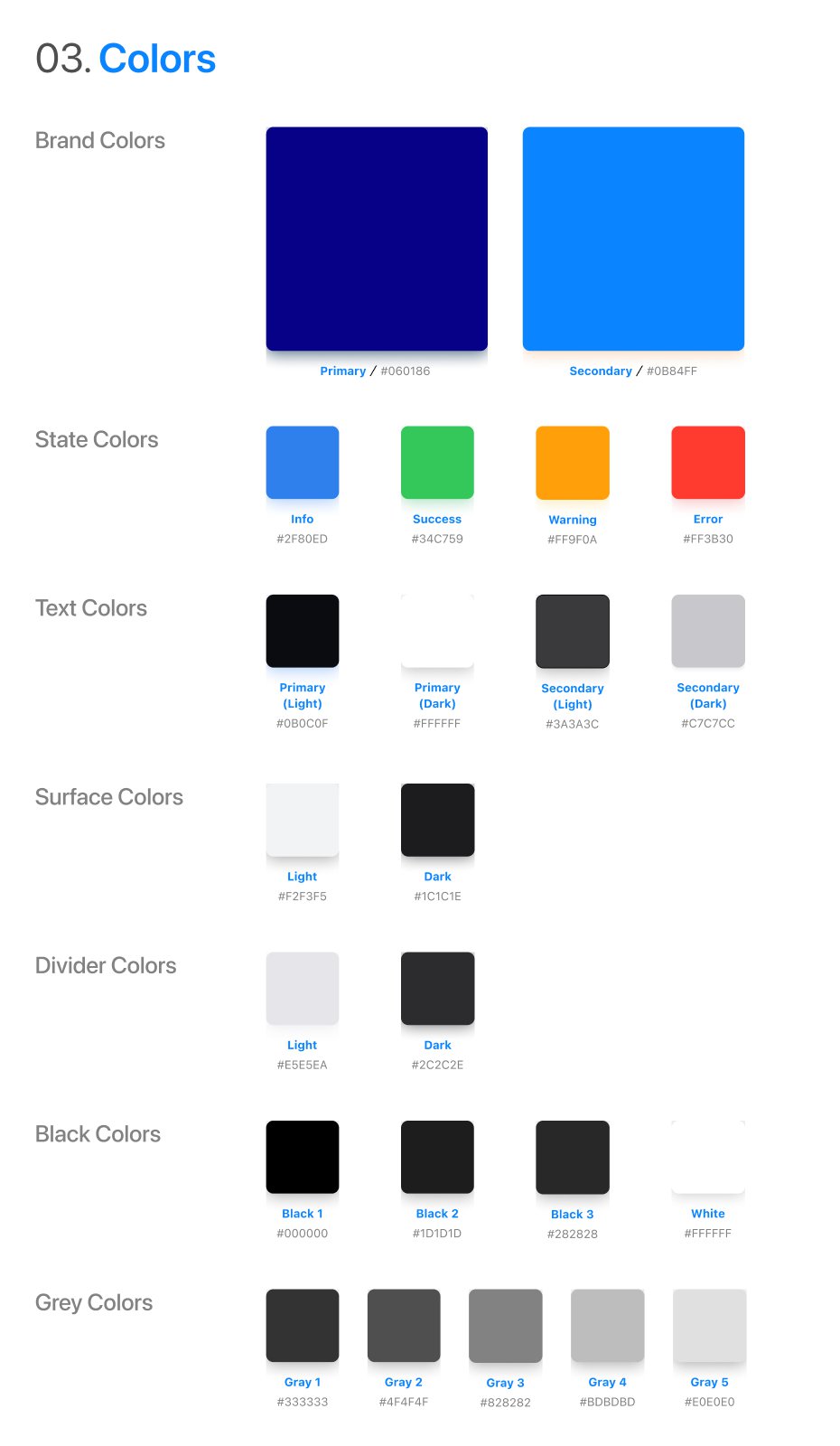
Colors
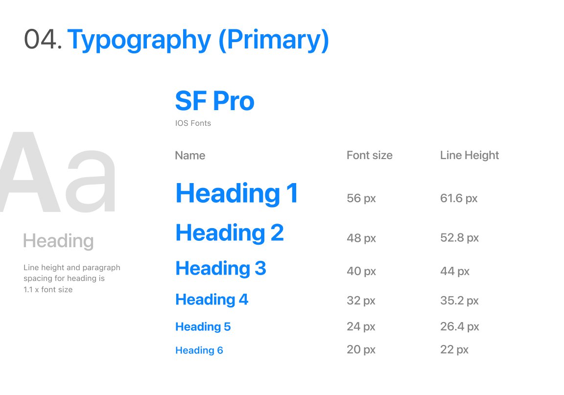
Typography
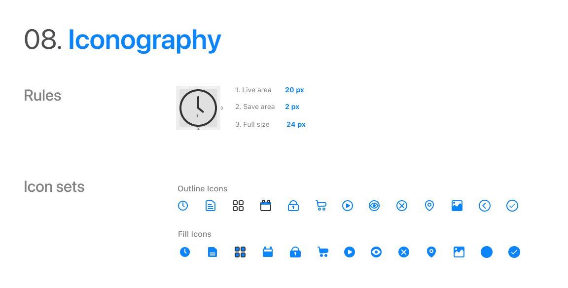
Iconography
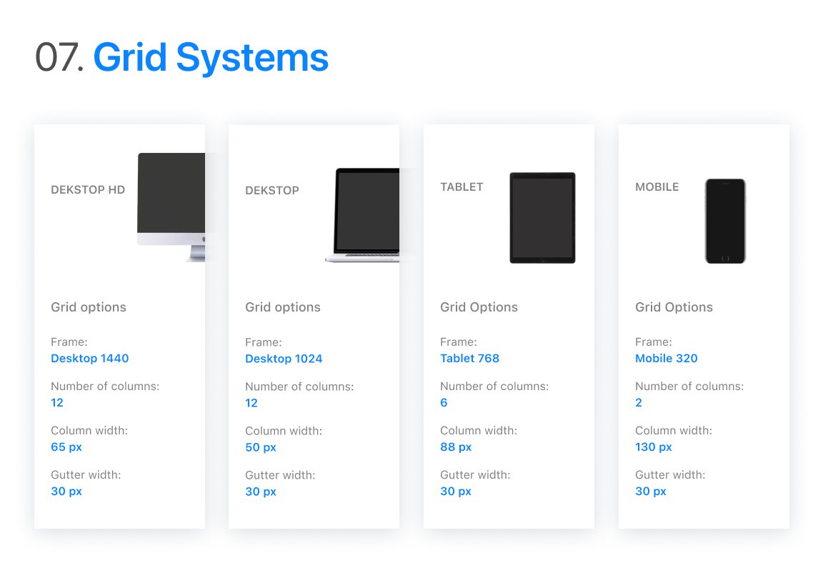
Grid
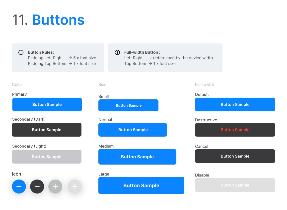
Buttons
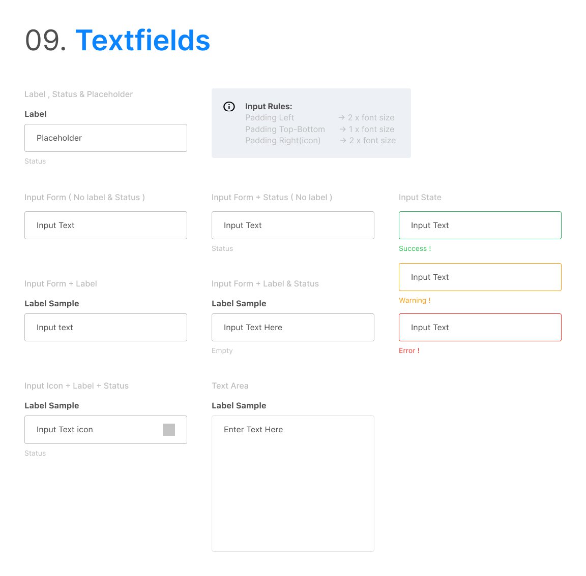
Text fields
Loading animation
Build
From Figma to a working prototype
We built the prototype as a single-page web app so it could run on any phone without an install.
Figma
Brand, components, flows and motion in one file
Vite + JavaScript
A lightweight single-page app
Mapbox
Web map, custom pins and routing
Vercel
Deployed for testing on real phones
What's next
From open data to a network
This is a studio prototype, and open data only goes so far. The next step is aligning the people who control access, so drivers don’t have to negotiate or guess.
- Partner venues that explicitly welcome delivery workers
- Crowdsourced verification from drivers
- Reliability and cleanliness scores
- Platform and city partnerships
See next
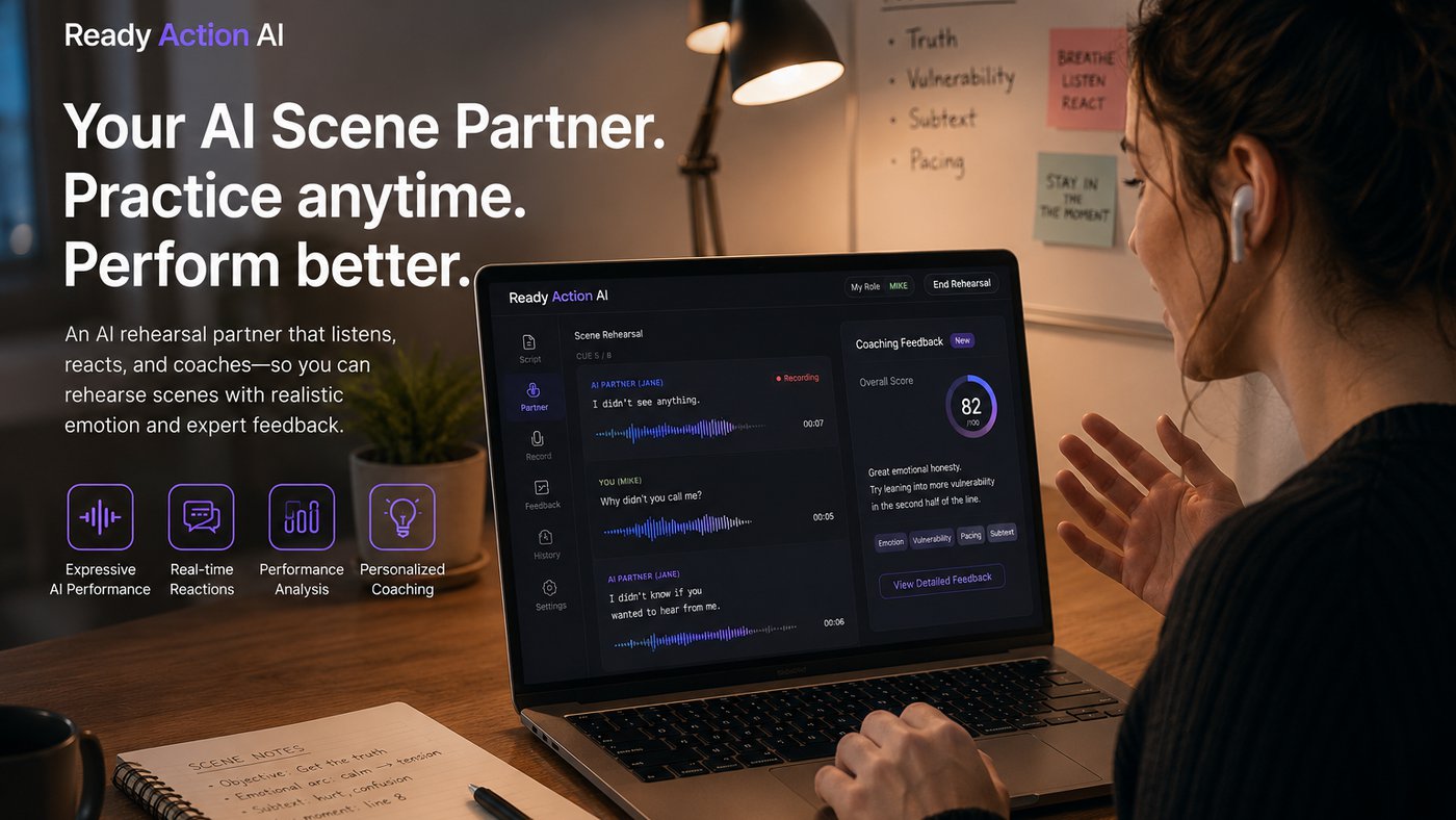 Ready Action: An AI Scene Partner That Listens, Performs, and Coaches
 Gus in the Room: Bringing a Dog Into the Classroom Through a Robot’s Eye
 Sober Buddy: An AI Player That Joins the Table
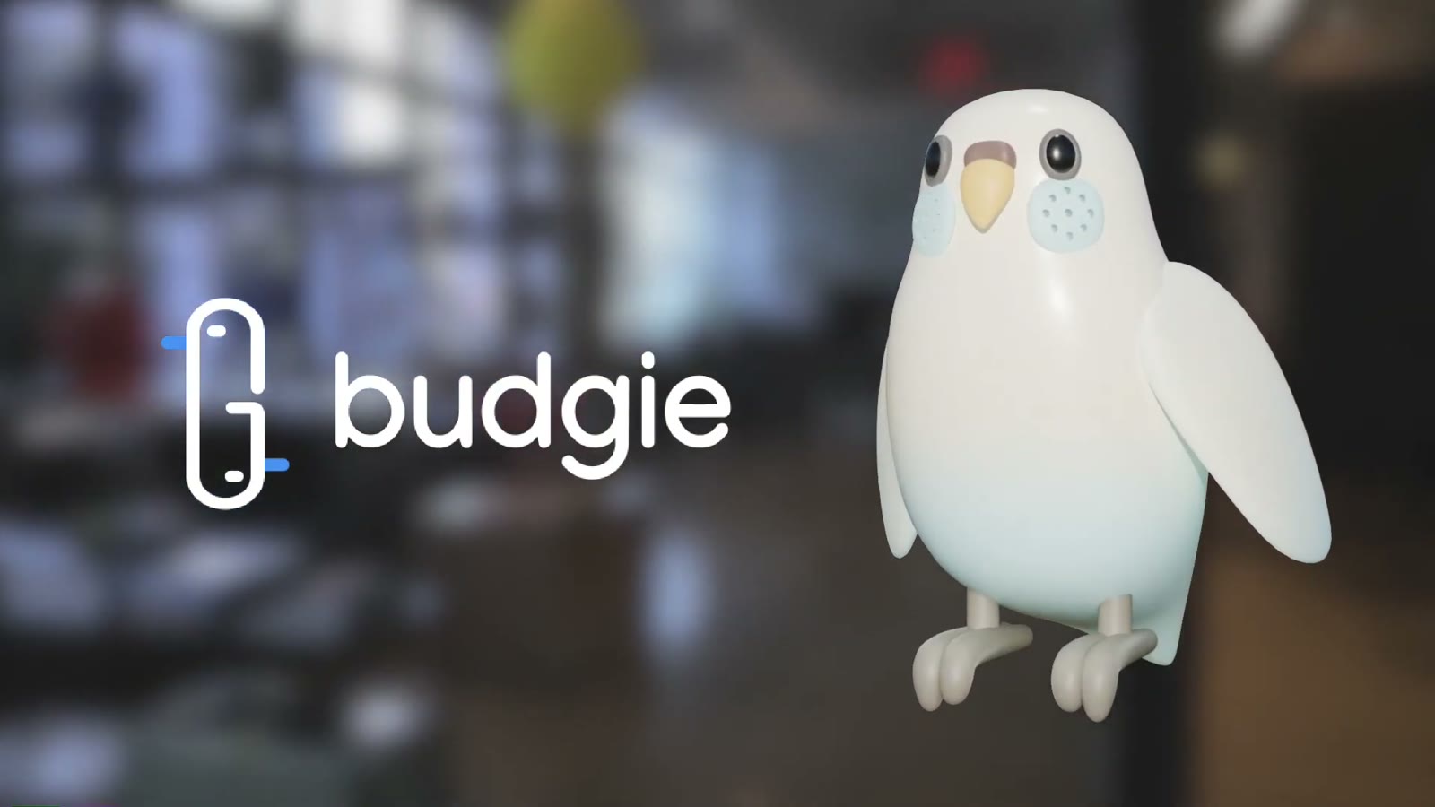 Budgie: Keeping Friendships Alive, One Chirp at a Time
 Dusty & Co.: Designing “Soft Clarity” for a Pottery Studio
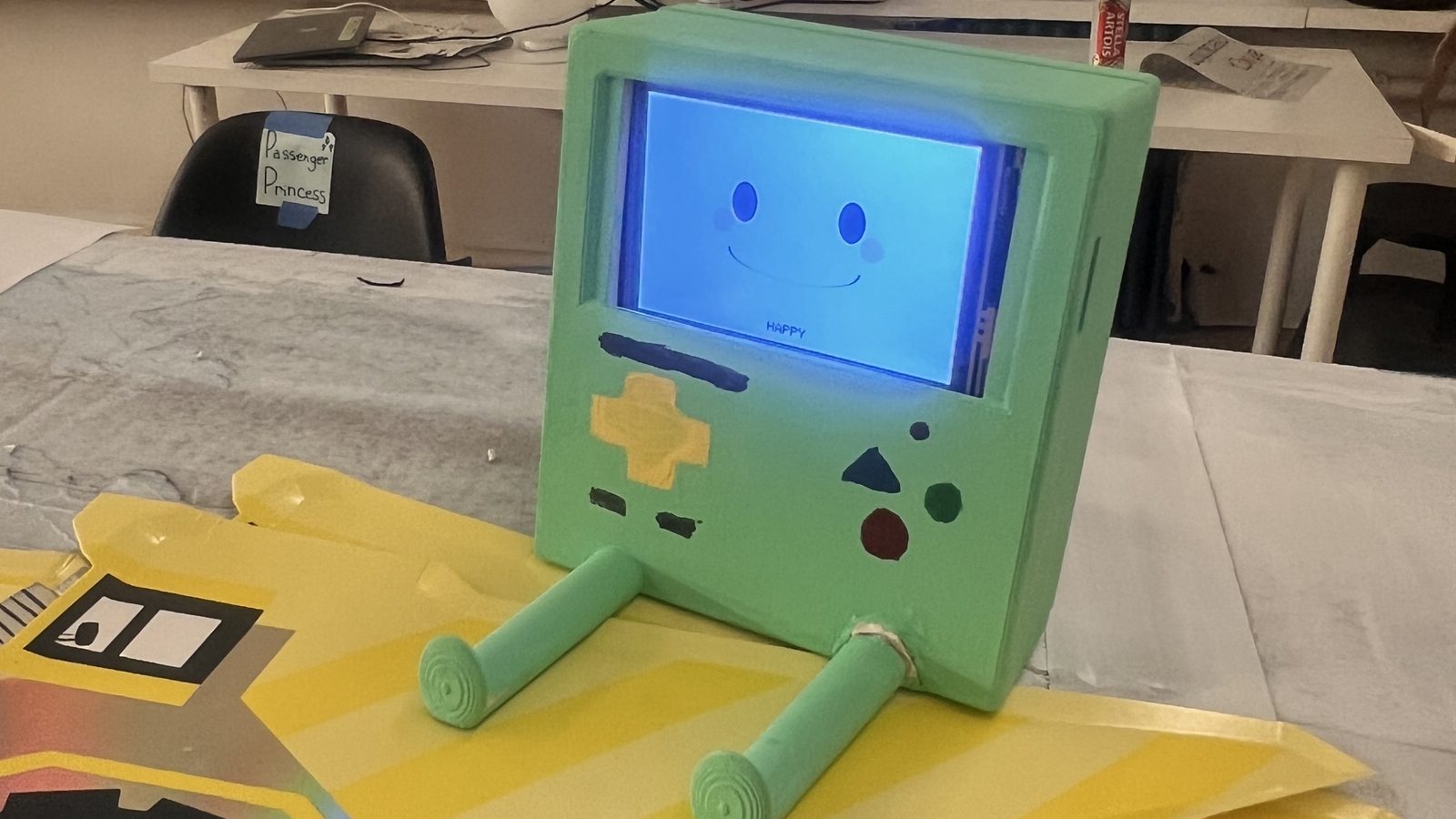 DriveBoy: An Emotional Co-Driver for Long-Haul Truck Drivers
 Industrious: Creating Natural, Authentic Connection in Shared Workspaces
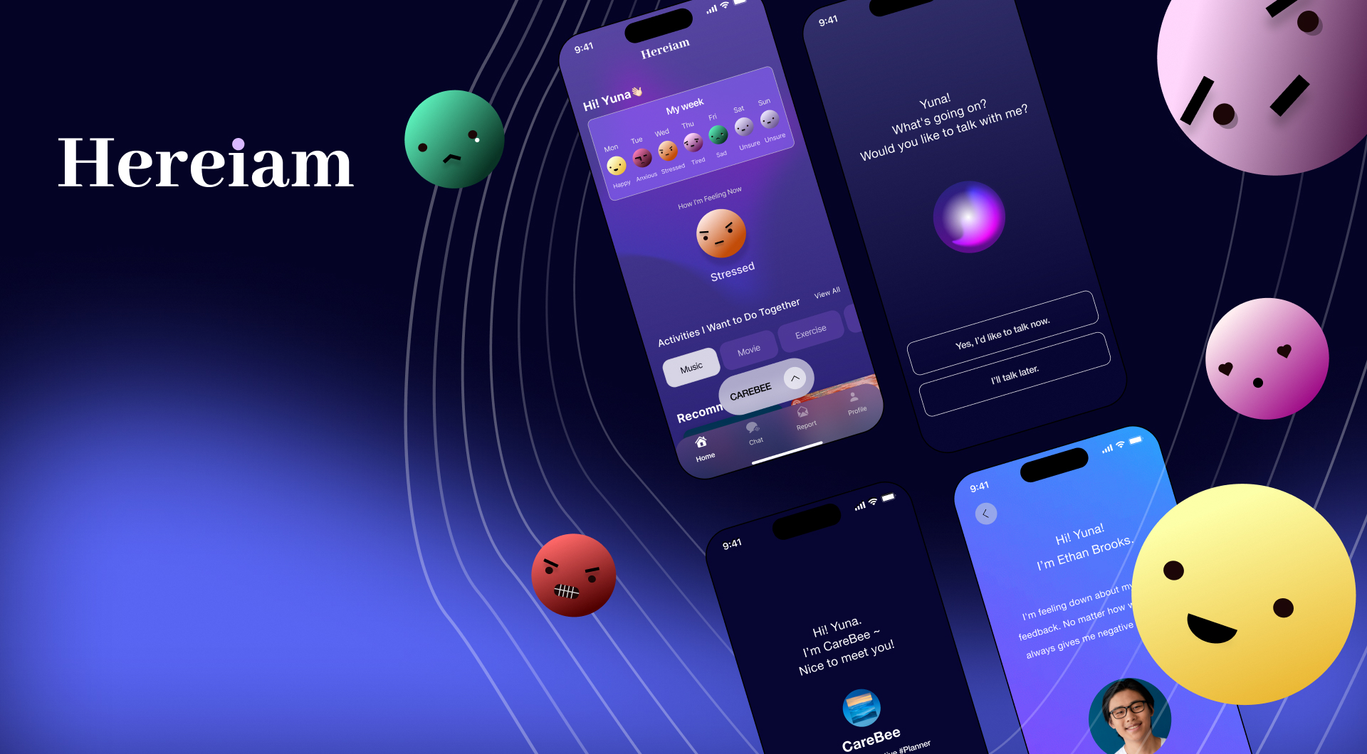 Hereiam: An AI-Driven Psychological Care Service
 Baekgomtang: A Climate Crisis Campaign Website
 Octofix: A Direct Alteration Service for Purchase and Repairs
 Exhibition Assistant: Planning an Exhibition Day Made Easy
 O!house Re-design: Personalized Home Tours and Deals← All work